Case Study
It's not every day a branding project comes with a crash course in Raman spectroscopy.
We had approximately a million questions. We also had an exciting assignment: help our new friend Din give this ambitious technology a new name, visual identity, and website that felt ready for the world.
When we first met Din, the founder of a young technology company called Eigen Control, he spent two hours walking us through some pretty remarkable science. His team was developing a way to use laser light and artificial intelligence to identify the chemical makeup of materials... in seconds.
The idea was to bring sophisticated laboratory analysis into the field, where industries like oil and gas could make better decisions with information they could access almost immediately.
Eigen is a mathematical term, and a pretty good one at that. But unless you spend your days around eigenvalues, it doesn't tell you much about the company behind the name. The business had also evolved well beyond the technology that originally inspired it.
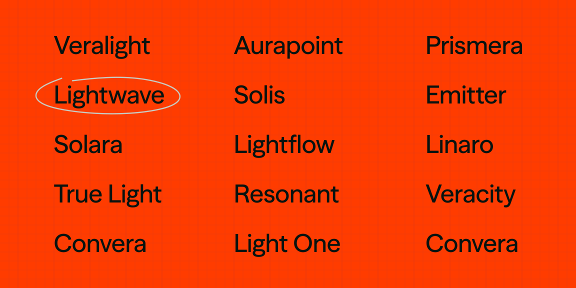
We explored names rooted in light, chemistry, precision, and discovery, inviting Din into the brainstorming along the way. Our ideas ranged from the obvious to the wonderfully obscure, including a hypothetical particle that travels faster than light.
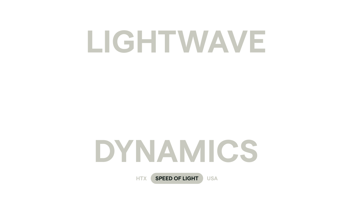
Eventually, we found ourselves coming back to Lightwave. Din suggested adding Dynamics for a little more distinction, and the name clicked.
What we loved was how established it sounded. It had the presence of a scientific institution that might have been around for fifty years, while still feeling like a company building something from the future. And with light at the heart of the technology, the connection felt natural.
We wanted the identity to carry that same feeling. Something precise, institutional, and quietly futuristic. The kind of brand you might expect to find on an exceptionally sophisticated piece of laboratory equipment.
The science gave us plenty to explore, and after a few creative rabbit holes, we narrowed our sketches down to seven concepts. Here's a little secret: we usually put our favorite design first in a presentation. Thankfully, Din liked the first one too.
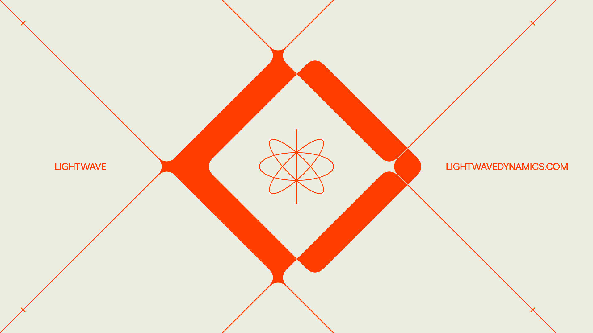
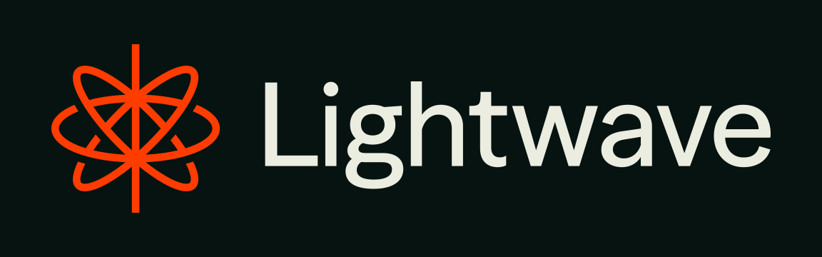
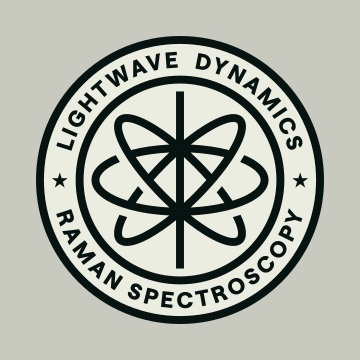
The chosen symbol combined a single vertical line representing the laser with intersecting elliptical forms inspired by atomic imagery. We refined the proportions, gave the linework a little more weight, and paired it with the typeface Season Sans.
The surrounding identity was deliberately restrained, with deep charcoal, warm off-whites, and a sharp red we called Laser. Together, they gave Lightwave a sense of scientific authority with just enough intrigue.
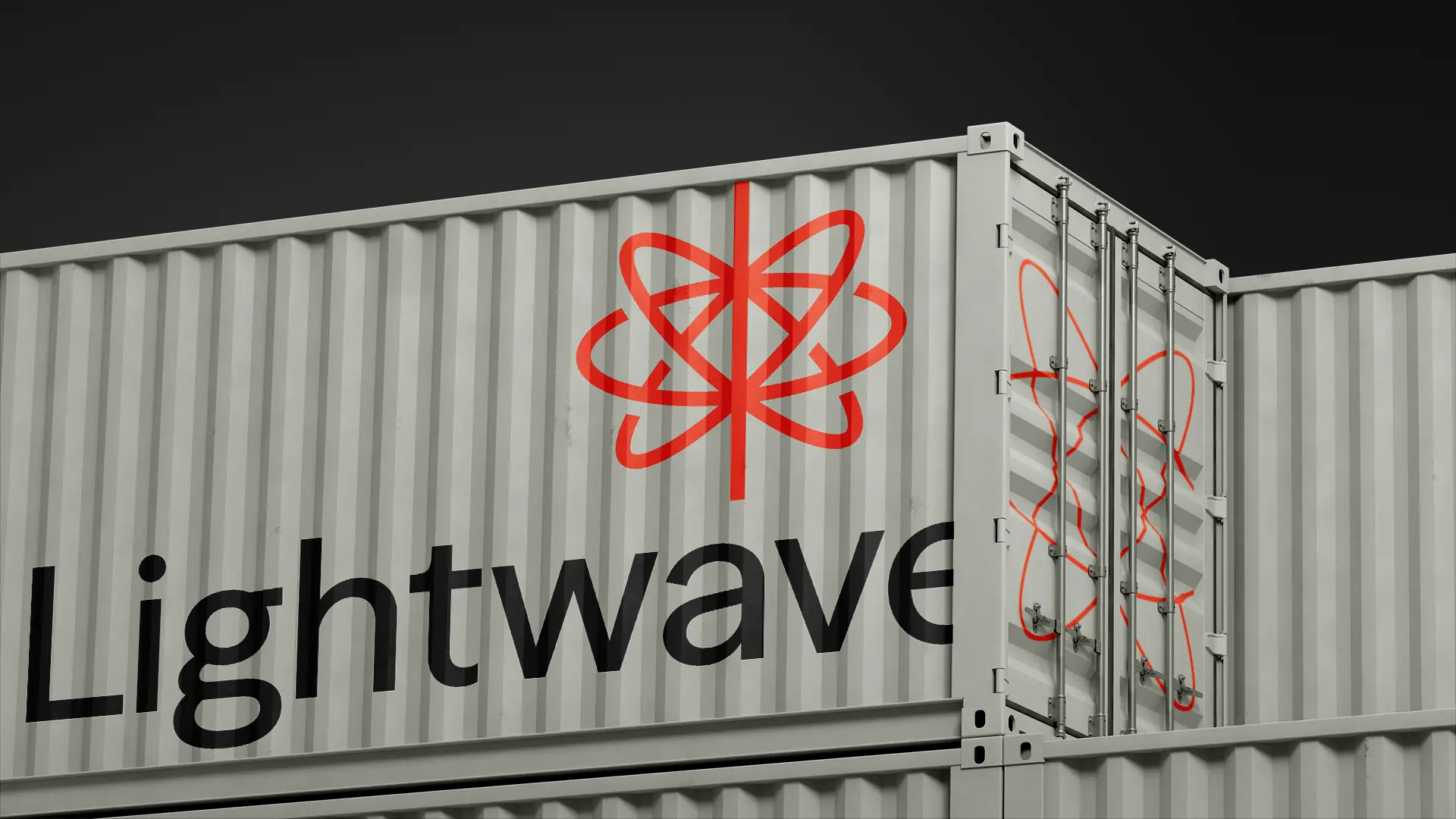
With the identity established, we had an opportunity to build an entire visual world around it.
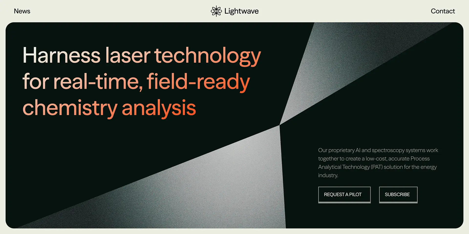
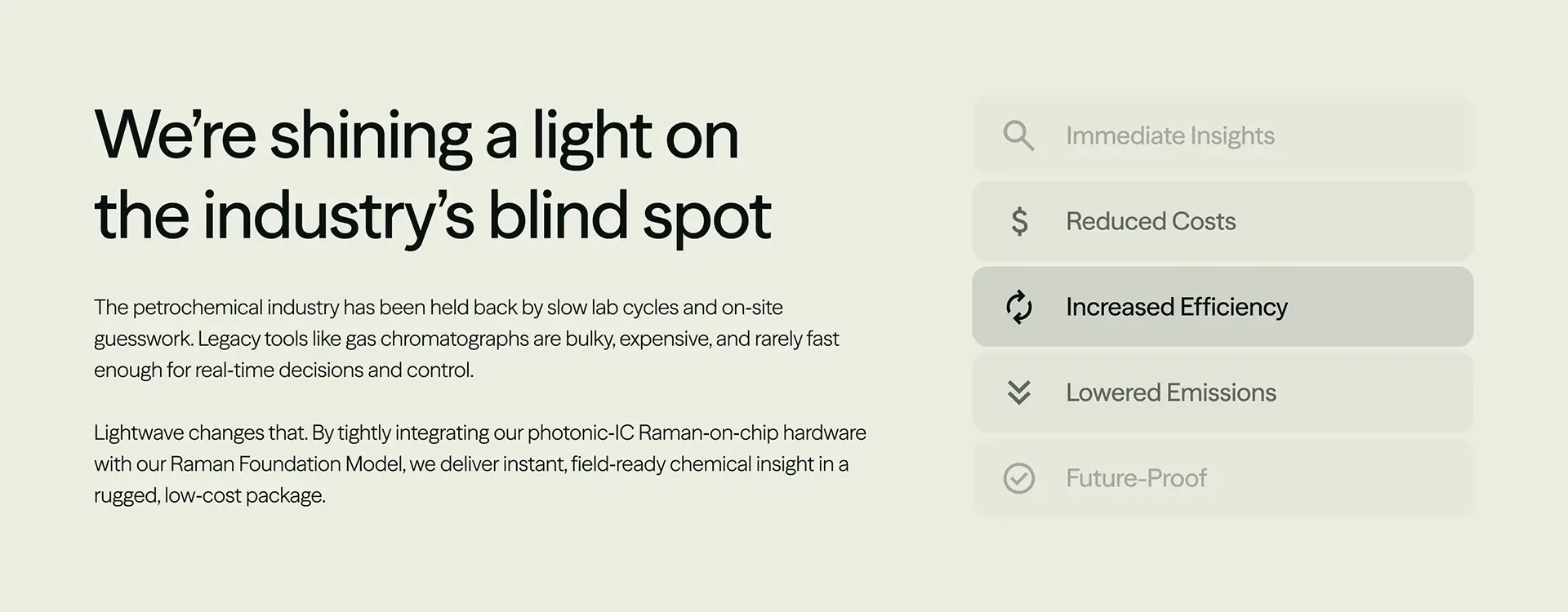
The website presented an interesting challenge. Lightwave was still developing and validating its technology, so we needed to communicate an ambitious idea to potential investors and partners, with very little product imagery to work with.
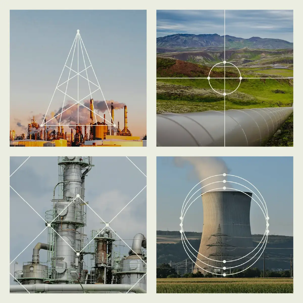
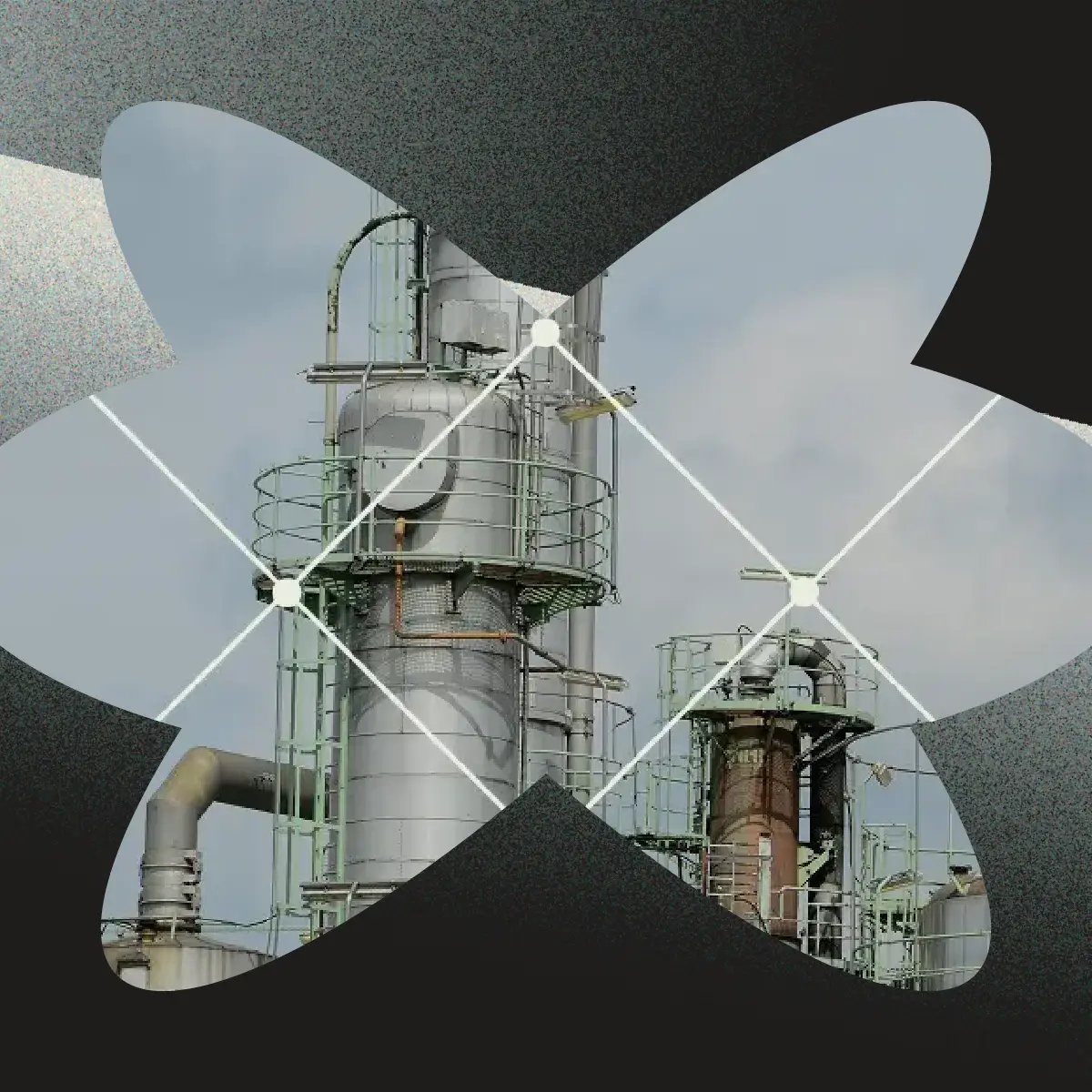
We let the brand do much of the heavy lifting. Stark contrasts, fine linework, atmospheric imagery, and occasional flashes of Laser Red brought the visual language to life. A flexible, modular layout also gave Din and his team room to grow as the technology evolved.
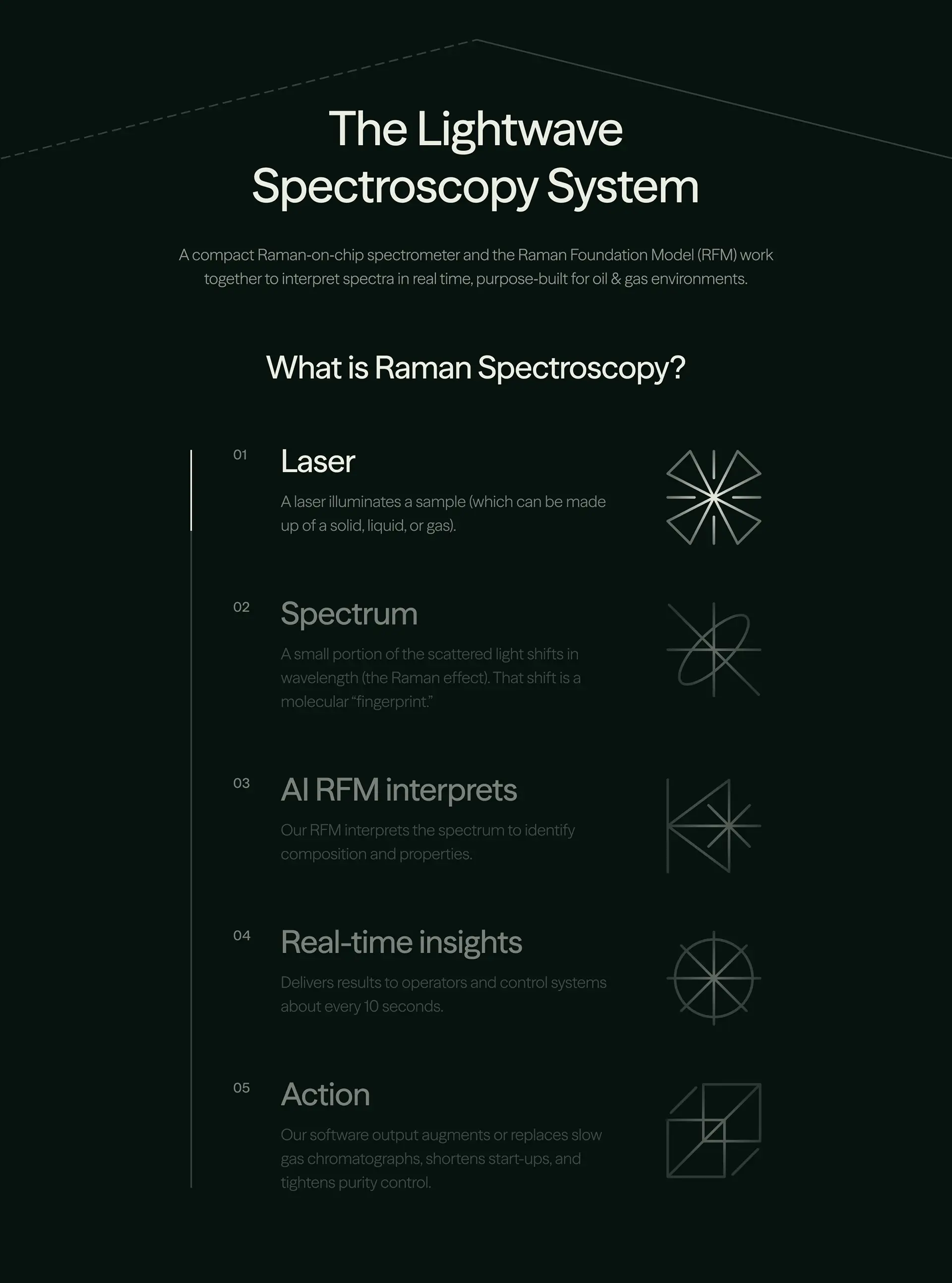
And then there was the writing. Raman spectroscopy is fascinating once you understand it, but most visitors aren't arriving with a background in analytical chemistry. We worked to make the science approachable, highlighting what the technology could do and why it mattered.
Our hope was that visitors would leave with the same feeling we had after that first meeting with Din: this is fascinating, and we want to know more.