Case Study
Have you ever had déjà vu, but you know it happened already? That’s exactly how it felt to us when Due North approached our team about rebranding. For context, we rebranded Due North just a few years back, so getting that email was a little scary. Thankfully, the sitch was that Due North had evolved and needed to reorient its brand and messaging. And bless them, they trusted us to do the work again.
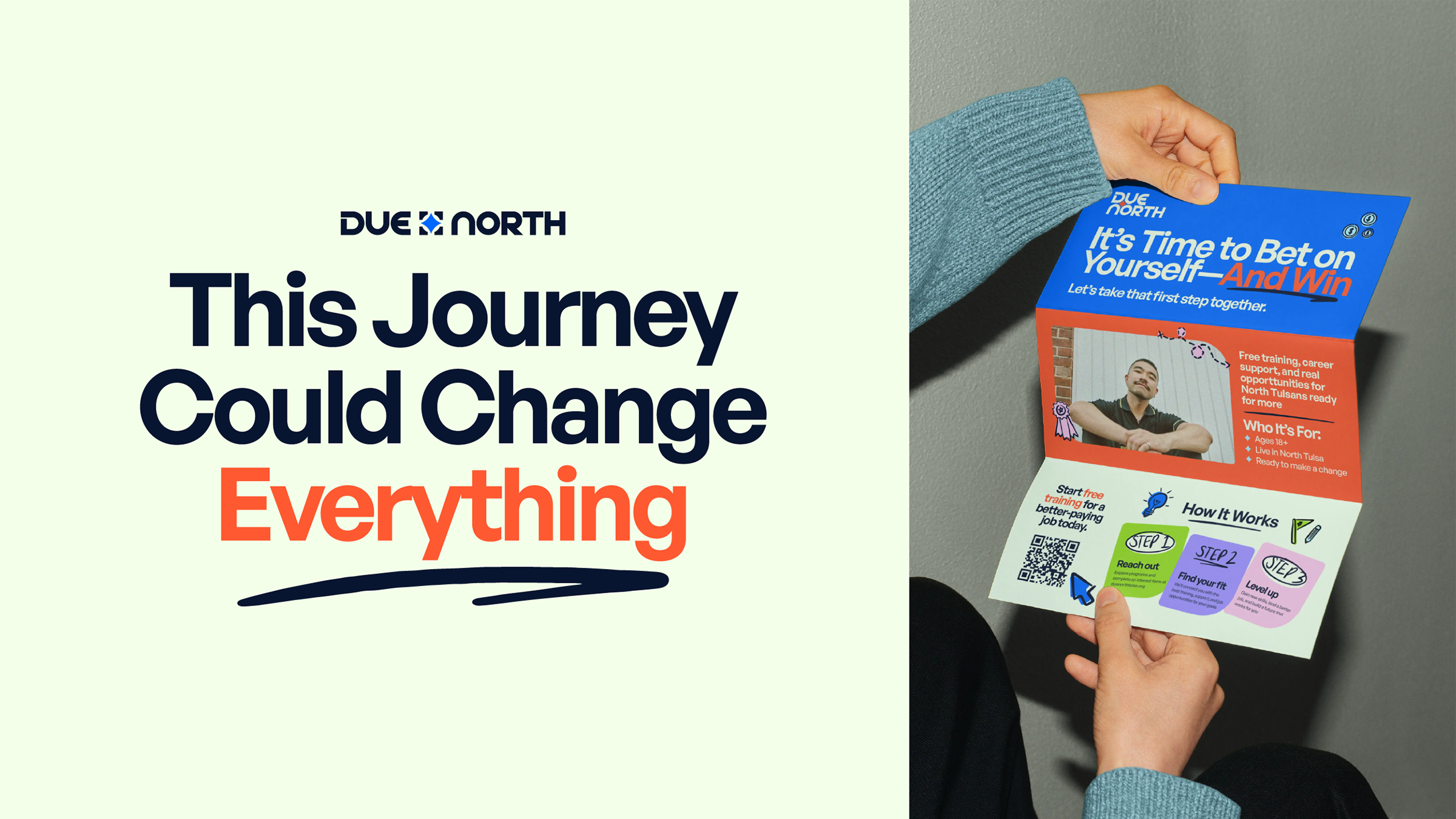
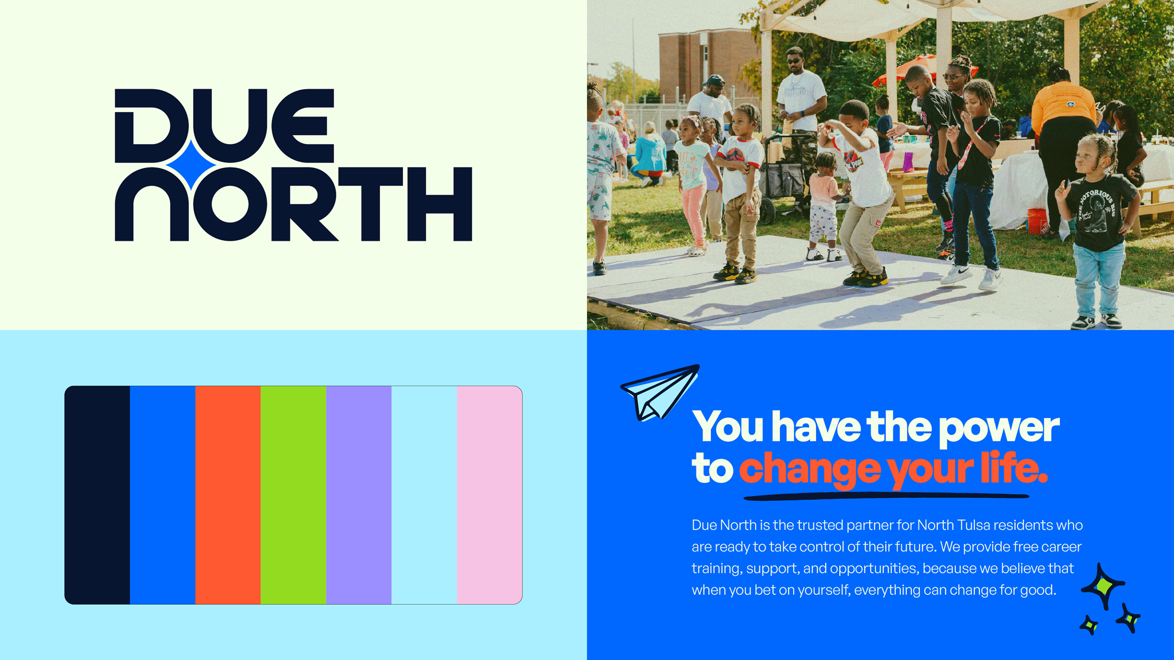
For North Tulsa residents ready to take control of their future, Due North is the trusted partner providing career training, support, and opportunity. They want to see a thriving community in North Tulsa and truly understand the power of betting on yourself.
So we went to work (again) on Due North, this time with a new approach and a fresh set of eyes from our very cool Gen Z art director, Megan. In our original rebrand, we took their existing logo and gave it a refresh. This round, we got to start from scratch. (No pressure.)
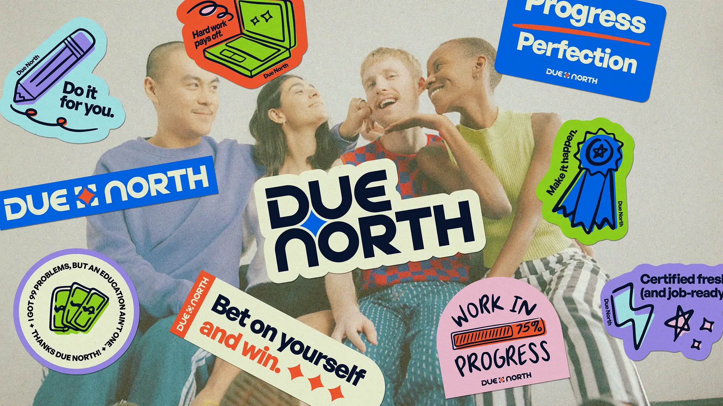
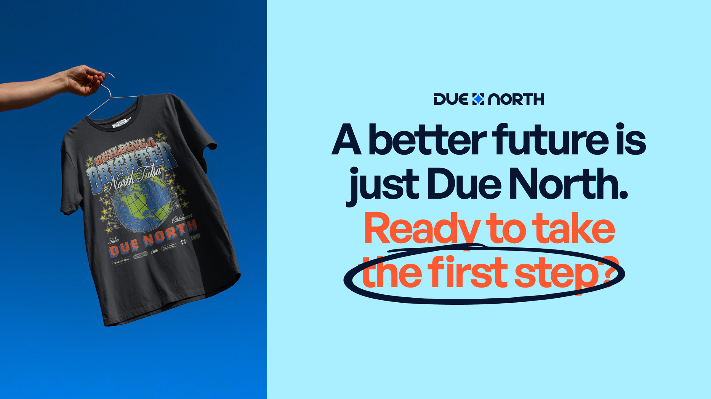
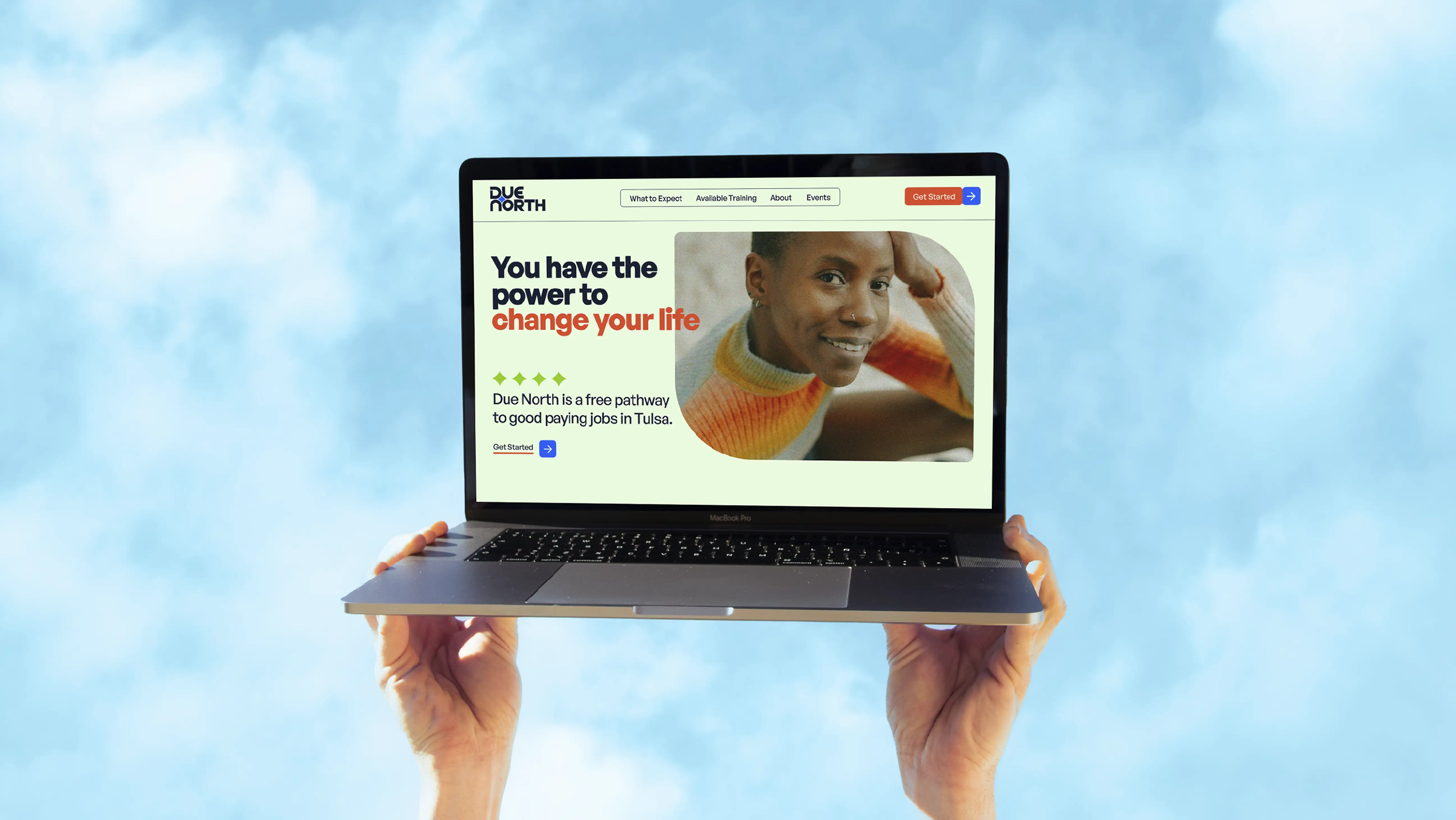
Through our clear and practiced process, we were able to land on a logo that felt so unbelievably obvious: a Due North wordmark that tucks the North Star into the negative space. Formerly a compass, the refreshed logo takes the literal “due north” out of the equation, leaving a more refined and symbolic mark. The colors are a stark contrast to the previous brand as well, transforming from its dark black and blue into a more vibrant and playful palette. This was chosen to make Due North more welcoming to all, while maintaining its air of seriousness.
On top of the logo, we took another shot at the messaging and tossed out most of the work from our previous engagement. (The good news is, our team has only gotten bigger and better.) We met with several Due North team members and partners to learn even more about their audiences, understanding what works and what doesn’t, and putting ego aside to completely transform how we communicate with the North Tulsans they serve.
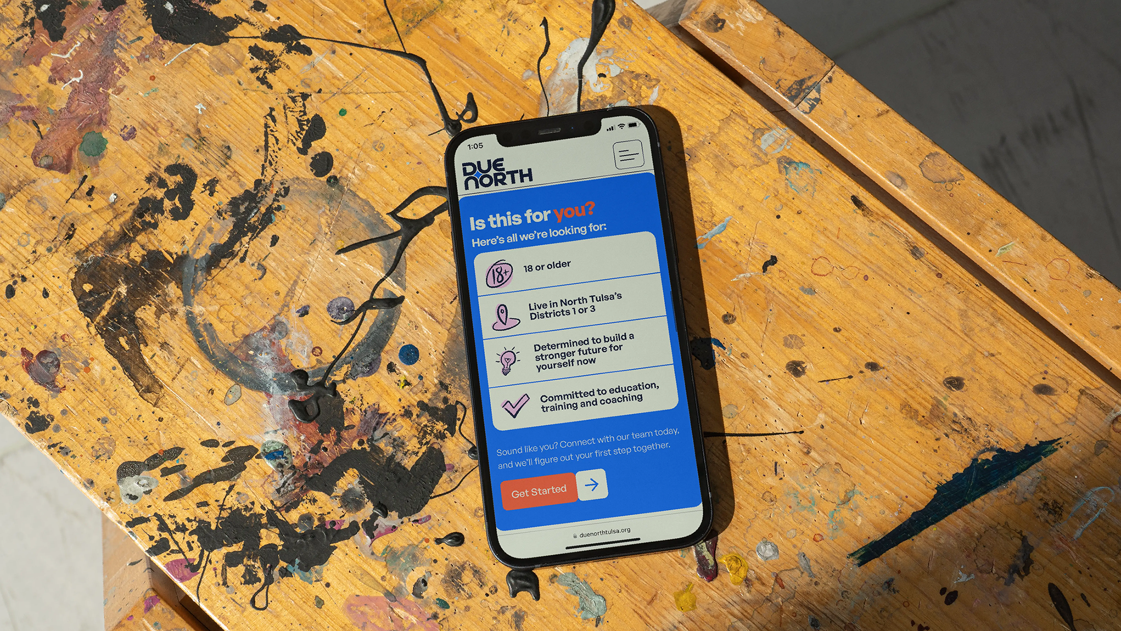
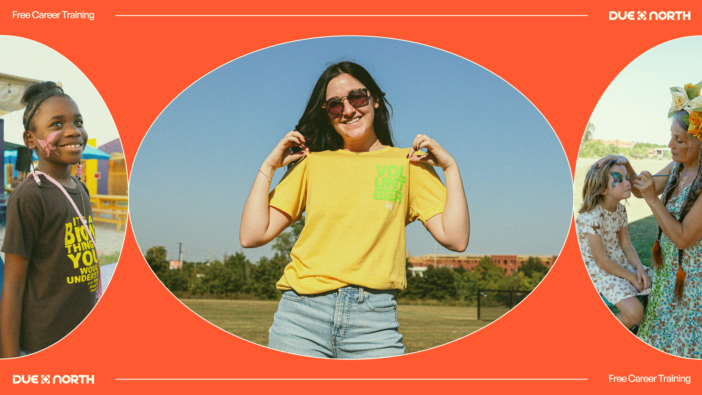
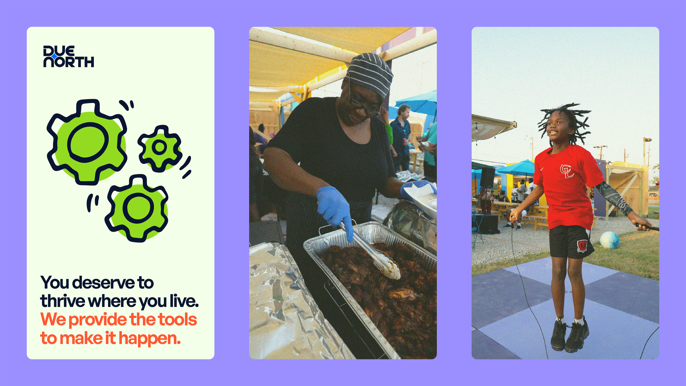
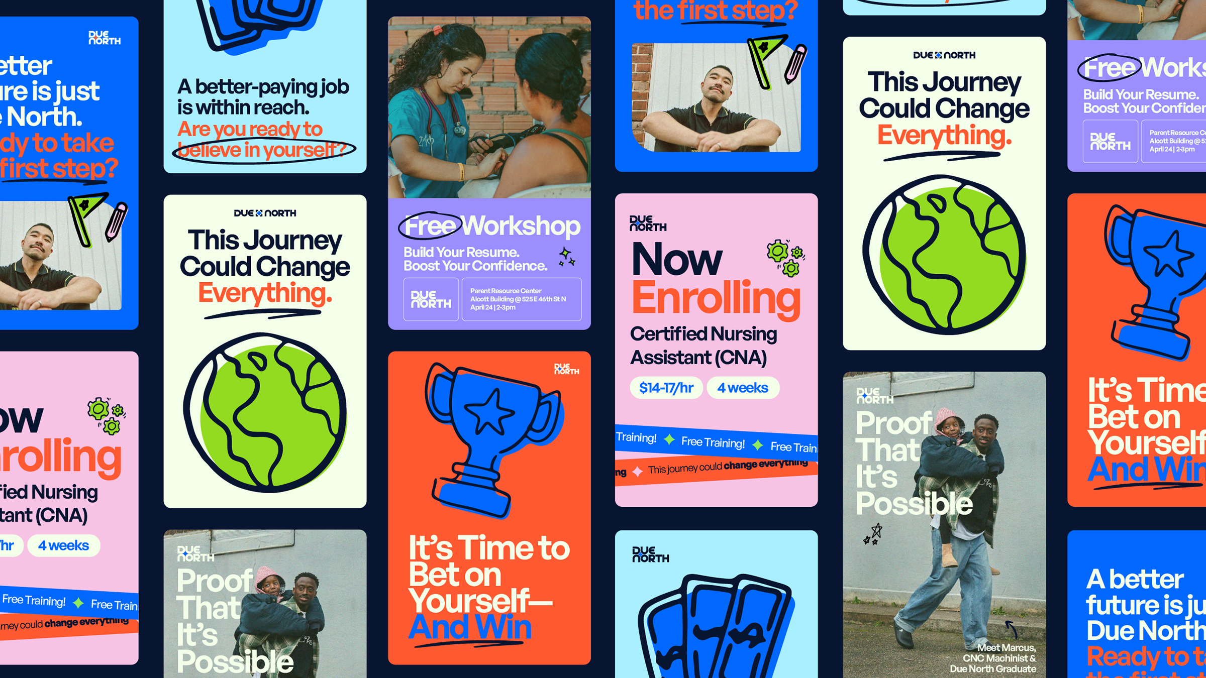
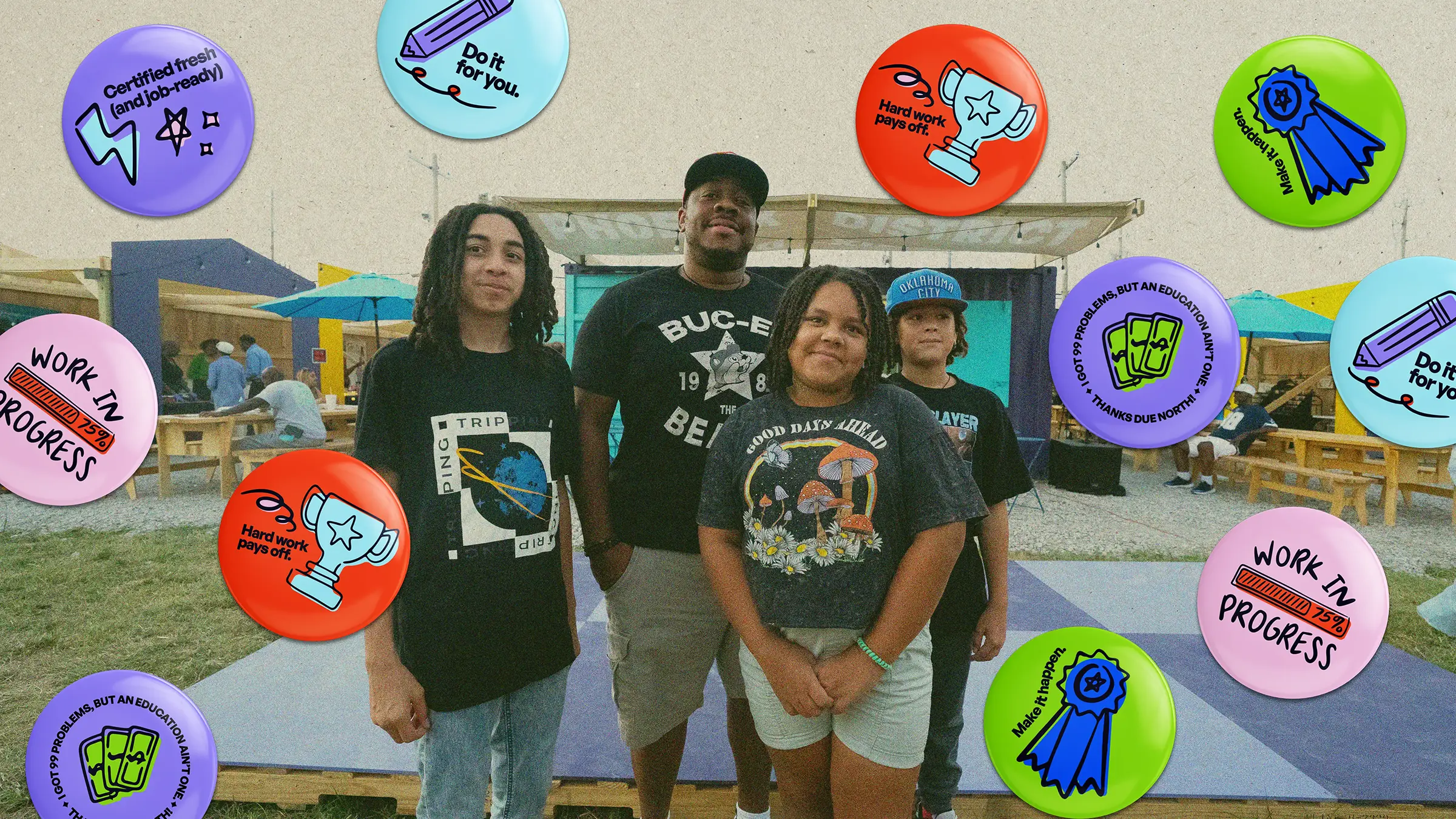
With a new brand identity in place, we dove into the website design. Suffice it to say, we went polar opposite from the last site. We implemented bright, inviting colors and an energetic design, inspiring action without playing into elementary or corporate looks often associated with traditional workforce sites. With an audience focused on late-20s to early-40s, we wanted to ensure all users can see a bit of themselves reflected in the design. This meant bringing in hand-drawn iconography and community portraits to reflect the real people making a change. And honestly, we just wanted the website to feel cool as h*ck to elevate the subject matter.
It’s a rare thing when agencies get a second chance to work on a project. While one of the more intimidating exercises our team has faced, we couldn’t be more proud of the work we did for Due North. We’re so fortunate to have played a small role in building better outcomes for our neighbors.